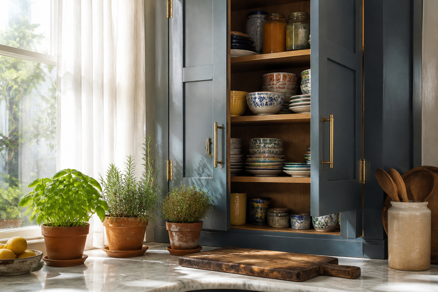
The right kitchen cupboard idea depends on whether you own the space or answer to a landlord.
Some choices cost a weekend and forty dollars in paint; others demand a spray rig, vented cabinet boxes, or a tolerance for visible brush marks that high-gloss finishes never forgive.
What unifies them is that each was tested in a real kitchen, from Galeana Younger’s electric yellow cabinets to Katie Hodges’s washer-dryer concealed behind Mouse’s Back panels, rather than dreamed up for a showroom wall.
1. Cheery Yellow Cabinets
Bright yellow cabinets carry a risk most renters never take, and that is exactly why they work.
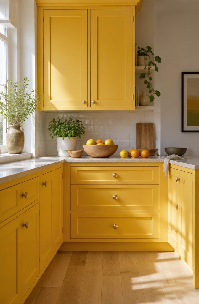
Babouche by Farrow & Ball sits at the sweet spot between orange and yellow, warm enough to feel like morning light rather than caution tape.
Designer Kit Kemp used it alongside pastel coral and baby blue in one kitchen, proof that yellow plays well with colors most people would not think to combine.
Galeana Younger went further, painting her mother’s cabinets in an electric yellow that prioritized joy over resale value. The effect, in a real kitchen, is less about the color itself and more about what happens to the room around it.
White walls flatten into a quiet frame. Wood floors pick up the same undertone.
Even cheap hardware looks intentional against that much confidence.
The catch is commitment. This is not a shade to test on one door and live with for a month.
Half-painted reads as indecision; fully painted reads as choice. Renters should check their lease for repainting clauses, but if the deposit allows it, the transformation costs only paint and a weekend.
The energy it adds to a kitchen, especially one that gets morning light, is the kind of detail that makes a rental feel like a place you chose.
2. Soft Neutral Tones
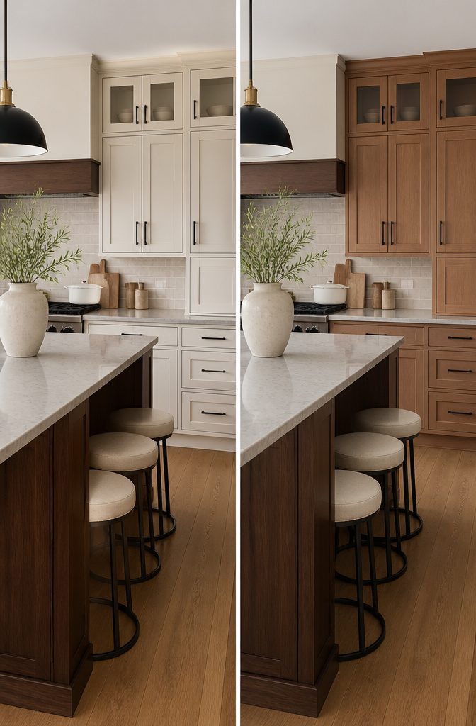
Muted neutrals on cabinets do the heavy lifting that bolder colors promise but rarely deliver. Benjamin Moore’s Natural Cream, a true greige, sits right where warm meets cool.
Against dark walnut on an island or espresso-stained floors, it keeps the eye moving instead of letting one dark mass dominate the room.
I nearly went forest green on my own uppers last spring. The sample looked rich for about three days, then oppressive.
Natural Cream won because it borrows light rather than fighting it, and it reads as intentional in every season rather than tied to whatever trend just passed through.
Dark hardware, black pendant lights, charcoal grout lines: all of it sharpens up against this color instead of sinking into murk.
The real test is five years out, when that "statement" color has become the thing you stop seeing. Neutrals this balanced age like stone, not like fashion.
3. Earthy Palettes
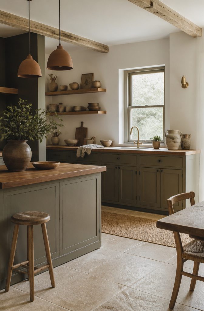
Mouse’s Back by Farrow & Ball sits right where brown meets gray, and it hides the scuffs that lighter cabinets show by month three.
The color reads as stone or weathered wood rather than paint, which matters in a kitchen where you want the room to feel settled, not staged.
I keep coming back to earth-toned cabinets because they let the materials around them do the work. A butcher-block counter, a clay pendant light, even the grain of a pine shelf all look intentional against this ground.
Designer Amanda Jacobs went a similar route in a Kentucky bungalow with Benjamin Moore’s Vintage Vogue, a smoky green that ages the room without darkening it into a cave.
The two approaches share the same logic: pick a color that already exists in wood, stone, or shadow, and the kitchen stops fighting its surroundings.
The practical side is hard to ignore. Grease, water marks, and the inevitable chip at the corner all soften into these tones instead of shouting for touch-up.
A weekend paint job with Mouse’s Back buys you a finish that looks forgiving on day one and stays that way.
4. Hazy Finishes
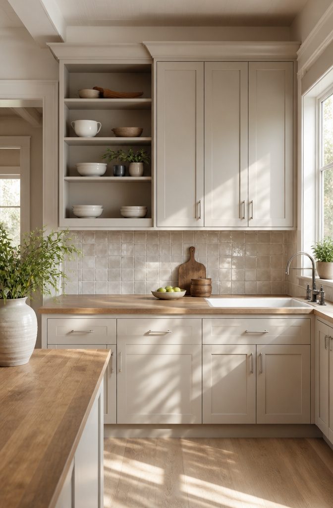
A hazy cabinet finish sits somewhere between matte and satin, with enough sheen to catch window light but enough pigment density to swallow reflection whole.
The surface looks like someone held a sheer curtain in front of a standard painted door, softening edges without dulling them completely.
That diffusion is what separates it from flat matte, which can read chalky and dead in a kitchen that already lacks natural light.
I spent an afternoon last spring convinced a sample board I’d ordered was simply a bad paint job. The color looked uneven, almost foggy, with patches that seemed lighter where the brush had lifted.
I nearly emailed the supplier about quality control before I held it beside a true matte swatch and saw the difference.
The hazy finish carried the same tone across every inch; the apparent variation came from how the finish scattered light at different angles rather than bouncing it back uniformly. **A poorly applied coat shows streaks or holidays where coverage failed.
A hazy finish shifts color slightly as you move, but never breaks.**
In a kitchen with strong overhead lighting, this quality becomes an advantage.
Where gloss cabinets throw hard rectangles of reflection onto countertops, hazy surfaces spread that light into a gentle glow that flatters both the room and the food in it.
5. High-Gloss Paint
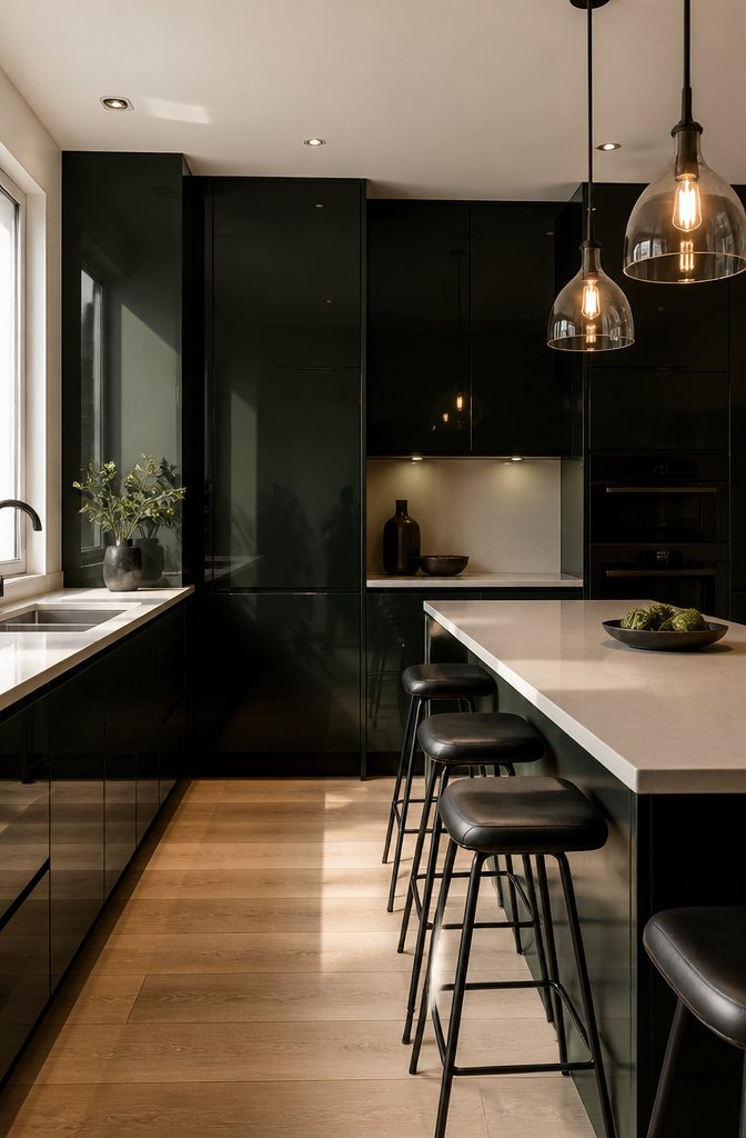
High-gloss paint on cabinets delivers the mirror-like depth that makes a small kitchen feel larger and brighter, but the application demands patience most weekend projects do not allow.
Benjamin Moore’s Vintage Vogue, a deep green-black, shows off the finish best: light skims across the surface instead of soaking in, and the color shifts from near-black in shadow to something alive where the sun hits.
The catch is that every brush mark, every speck of dust trapped in the wet film, becomes part of the final look.
On my first attempt, I used a high-quality brush and still ended up with faint ridges that caught the light like scratches on glass.
The only way to get the factory-smooth surface is spraying, which means renting equipment, masking the entire room, and accepting that your first coat will look worse before the second or third saves it.
In daily use, the finish performs better than expected: grease wipes off without leaving a film, and the hard surface resists the micro-scratches that matte paints collect by month three. The trade is visibility.
A satin cabinet hides the bump from a hurried hip; high-gloss records it like a photograph.
For renters or anyone who needs to live in the kitchen while working, this is a finish to admire in showrooms and skip at home unless you have the space and time to do it once, correctly.
6. Pink Cabinets
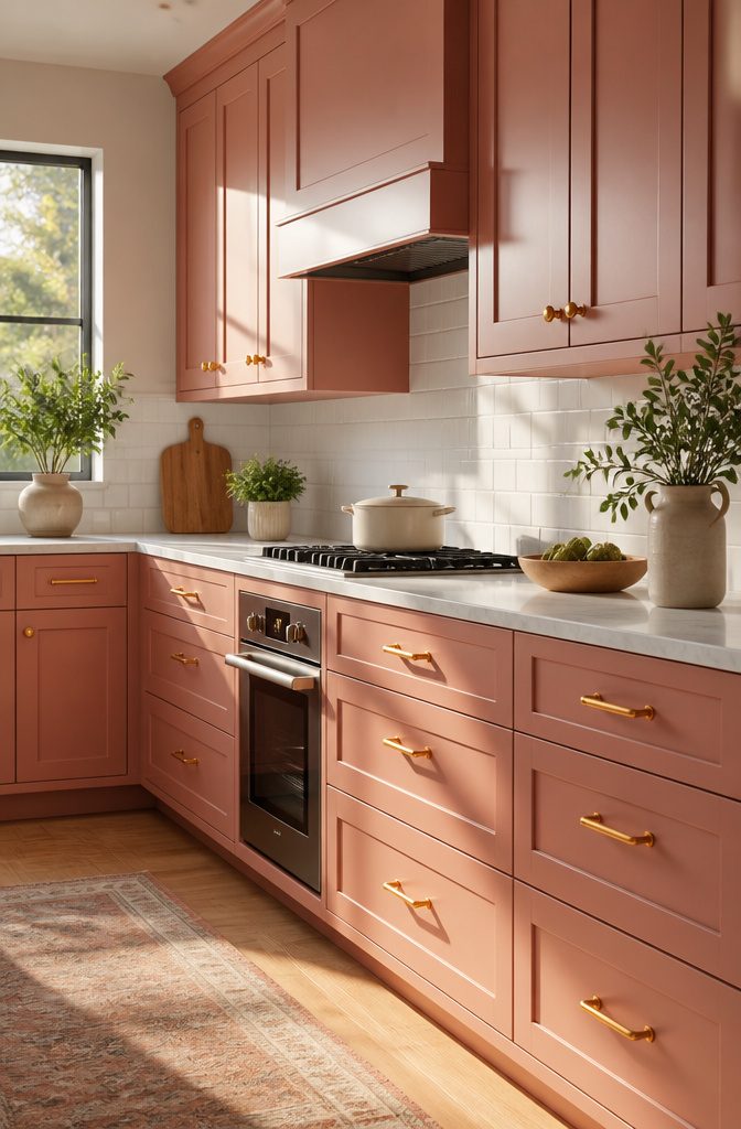
Painting kitchen cabinets pink still makes most people pause, and that hesitation is worth listening to before you commit. The color reads very differently in practice than it does on a swatch held at arm’s length.
What looks like a soft, livable blush under the store’s fluorescent tubes can flatten to something saccharine or, worse, muddy once it covers twenty linear feet of cabinetry and absorbs your kitchen’s particular light.
The surprise comes in how it shifts through the day.
A terra-cotta pink, the kind architect Erin Cypress used in a Nashville butler’s pantry, can look almost neutral and warm in morning light, then turn distinctly rosy by late afternoon when the sun drops lower.
That same warmth at 9 a.m. becomes the color by 4 p.m.
Gray undertones help the shade settle into a space rather than perform for it, and they keep the cabinets from competing with whatever else lives in your kitchen: copper pots, white tile, wood grain.
For renters or anyone testing this without a full gut renovation, the entry cost is a weekend and a gallon of cabinet-grade paint. The risk is not the money.
It is waking up six months in and discovering your kitchen has a personality you did not fully audition.
7. Embracing Color Broadly
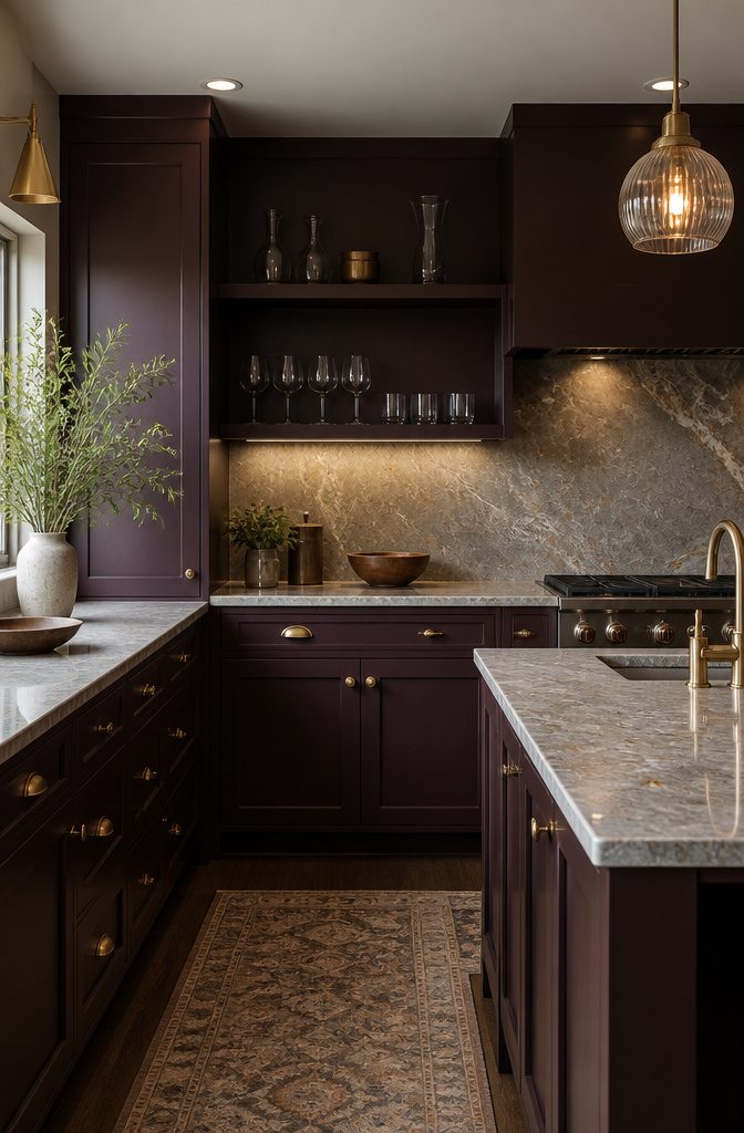
Safe colors on kitchen cupboards last about three years before they start feeling like background noise.
That was the mistake I made in our last rental: sage green looked current in every magazine I opened, so I painted the uppers and lowers the same shade and called it done.
Within eighteen months the kitchen felt like a waiting room.
The color that survives is one you notice without naming it first. I now test a shade by living with a painted board propped against the cabinets for a full week of morning coffee and evening cleanup.
If I stop seeing it by Wednesday, it is too tame. If I wince once, it is too much.
Trend colors announce their year. The 2024 terracotta I almost chose already reads like a timestamp in photographs.
Deeper, stranger colors, aubergine or dusty mineral blue, age better because they were never the color of the moment to begin with.
For renters, the cost of being wrong is a weekend and forty dollars in paint. That is low enough to risk something that makes you pause before you reach for the cereal bowl.
8. Keep It Rich
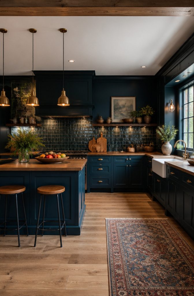
Deep, saturated cabinet colors read as luxurious rather than dark when the undertone leans warm.
Navy with a hint of teal, forest green that pulls olive in afternoon sun, or a burgundy that stays wine-colored instead of sliding toward brown: these shades hold their depth without turning the kitchen into a cave.
The mistake most people make is pairing them with the same lighting they used on white cabinets. Rich cabinets need roughly double the light output to keep the color looking intentional rather than accidental.
Pendant lights over an island that look bright enough on their own will disappear against charcoal uppers; the eye reads the contrast as shadow rather than drama.
Under-cabinet strips become non-negotiable, and a window treatment that filters instead of blocks keeps the saturation honest. The kitchen I keep thinking about had gorgeous emerald lowers and a single flush-mount ceiling fixture.
By 4 p.m. the room looked like a basement rec room someone had painted in a hurry.
9. Minimalist Cabinetry
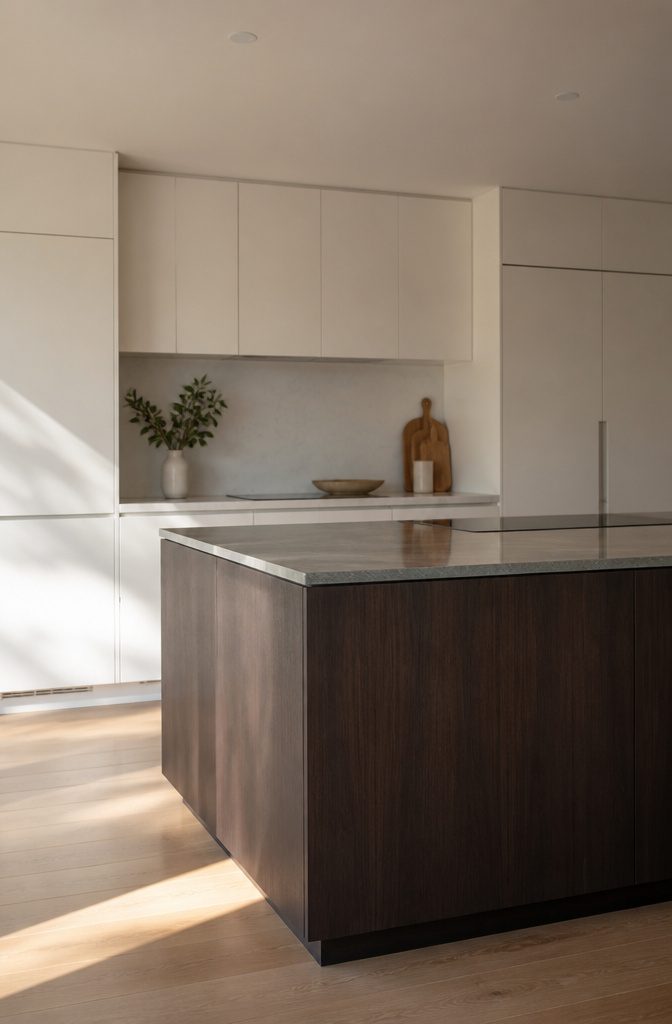
Minimalist cabinetry is not the same thing as plain slab doors, though most showrooms will steer you toward both at once. True minimalism means every edge, reveal, and gap has been studied and reduced on purpose.
The door might have a tiny bevel that catches light just enough to read as a plane rather than a board, or the frameless box might be built so the door itself becomes the only visible line.
That restraint costs more than you’d guess. A slab door from a mid-grade line runs cheap because it is fast to build and forgiving to install.
The quiet, precise version with shaved-down gaps and hidden adjusters needs tighter manufacturing and a patient installer, so the price climbs even though you are technically getting "less."
I learned this the hard way quoting a kitchen refresh last spring: the pared-back Italian system came in higher than a traditional raised-panel job from the same supplier.
For a renter or a first-time owner, the move is to borrow the look without the cabinet price.
Replace bulky hardware with edge pulls routed into the door itself, or paint existing flat panels in a single tone that matches the walls so the boxes visually disappear.
The effect reads as calm and intentional, which is the whole point, not as absence.
10. Pair Old and New Cabinetry
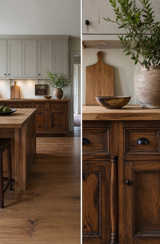
Mixing antique cabinets with new ones gives a kitchen a warmth that matched sets rarely manage, but the gap in construction eras shows up first in the measurements.
A solid walnut cabinet from the 1960s, like the ones Chandler Quarles used under her island, was built to inch-and-fraction standards that modern factory cabinets round to the nearest half-inch.
That quarter-inch difference, repeated across a run of cabinets, stacks into a visible misalignment where the countertops meet or the doors swing.
The visual effect works when the old piece reads as intentional, not salvaged.
Quarles tied her antique walnut to new cabinetry by keeping the finish in the same tonal family, so the warmth carried across the whole kitchen rather than stopping at the island.
The risk is a curated look that feels too studied, too English-country-house for a Tennessee breakfast room. What convinced me, reading how that project came together, was that the antique cabinets stayed below eye level.
Upper cabinets in a single style keep the kitchen from reading as a collection, and the vintage piece becomes furniture rather than a design statement.
11. Mix and Match Storage Styles
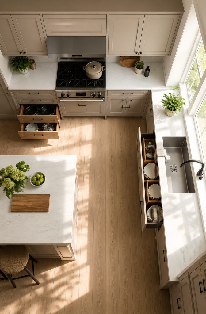
A bank of identical cupboards looks tidy on a plan, but drawers near the stove and doors near the sink is where the logic actually lives.
The passage from Studio Thomas James shows the move: a pull-out for trash, varied drawer depths, and tall cabinets for wine glasses all in one run.
The eye reads it as a single block because the finishes match, while the hand finds the right tool for each job.
Upper cabinets favor doors because plates stack vertically and who wants to lift a whole drawer overhead? Lower cabinets earn their depth in drawers, where pots slide out to meet you instead of disappearing into shadow.
The mix only reads as clutter when the fronts fight each other; keep the hardware consistent and the eye glazes over the function underneath.
My own kitchen leans harder on drawers than the original plan allowed, and the one fixed shelf under the cooktop still annoys me. A pull-out there would have caught the sheet pans I stack sideways now.
The wine-glass cabinet in the source is the reminder: tall narrow storage belongs at the ends of runs, where it does not steal working depth from the counter above.
12. Oversized Storage Spaces
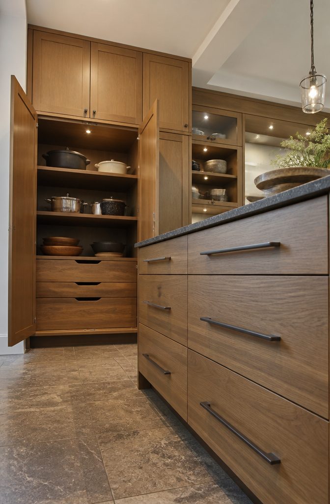
A cabinet built for platters, Dutch ovens, or the slow cooker you only pull out for game days needs at least 15 inches of vertical clearance inside.
The common mistake is measuring the appliance itself and calling it done, then watching the door swing arc knock the whole thing sideways.
Base cabinets at the island work well for this, since the door path stays clear of wall and corner conflicts.
Add three inches to your tallest item before you cut the shelf height, and check whether the door hinge swings into that zone.
Deep drawers read as oversized storage too, but only if the glide hardware can handle the weight; most side-mount pairs top out around 75 to 100 pounds.
If the load sits higher, a fixed shelf with a wide opening beats a drawer that sags by spring.
13. Appliance-Hiding Cabinets
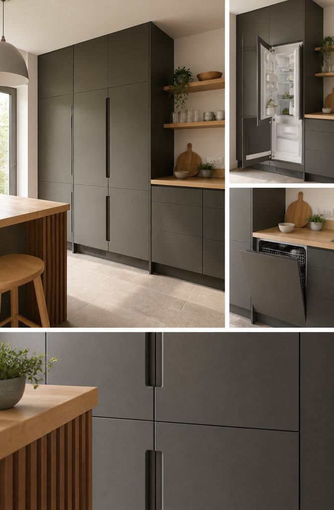
Appliance-hiding cabinets let a fridge or dishwasher disappear behind a panel that matches the rest of the kitchen, but the look only works if the mechanics are planned from the start.
Designer Katie Hodges ran into this exact puzzle in her Hollywood Hills home, where square footage ruled out a separate laundry room and the washer-dryer had to move into the kitchen.
She tucked the pair behind custom cabinets painted in Farrow & Ball’s Mouse’s Back, a muted gray-brown that reads as built-in furniture rather than an afterthought.
The catch is heat.
A standard cabinet box traps the exhaust from a refrigerator compressor or a drying cycle, so vented cabinets are the only safe move here, with louvered doors or a hidden grille cut into the toe kick or side panel.
Appliance specs list the required clearance; ignore them and the motor runs hotter, works harder, and fails sooner. Integrated hardware also needs attention, since the panel-mounted door must align precisely with adjacent cabinets and still clear the appliance hinge swing.
Hodges’s solution worked because the ventilation was designed in, not added after the paint dried.
14. Vented Cabinets
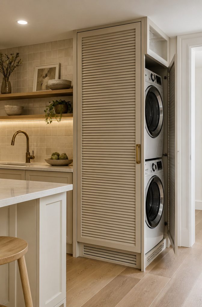
Vented cabinets solve the problem every apartment dweller with a stacked washer-dryer knows: the machines have to live somewhere, and the kitchen is often the only wall that works.
The ventilation is built right into the cabinet frame itself, usually through a louvered toe kick, a perforated panel, or a gap engineered behind the door that stays hidden when closed.
Air moves enough to keep the dryer from overheating and the moisture from warping the shelves, but the appliance disappears behind what reads as ordinary pantry storage.
Designer Katie Hodges took this approach in a Hollywood Hills home where square footage ruled out a separate laundry room.
Her cabinets conceal the full laundry setup behind doors coated in Farrow & Ball’s Mouse’s Back, a warm gray-brown that reads as intentional kitchen furniture rather than a utility workaround.
The paint color matters here: because these cabinets sit in the main kitchen sightline, they have to match the surrounding cabinetry or at least coordinate deliberately. A vented cabinet that looks like an afterthought defeats its own purpose.
The real limitation is clearance. Most dryers need several inches of rear space for the duct, and the cabinet interior has to accommodate that without swallowing the whole depth of a standard base cabinet.
In a galley kitchen, that trade can eat the storage you were hoping to gain. I would size the cabinet for the appliance first and let the shelving adjust, not the other way around.
15. Split Upper and Lower Treatments
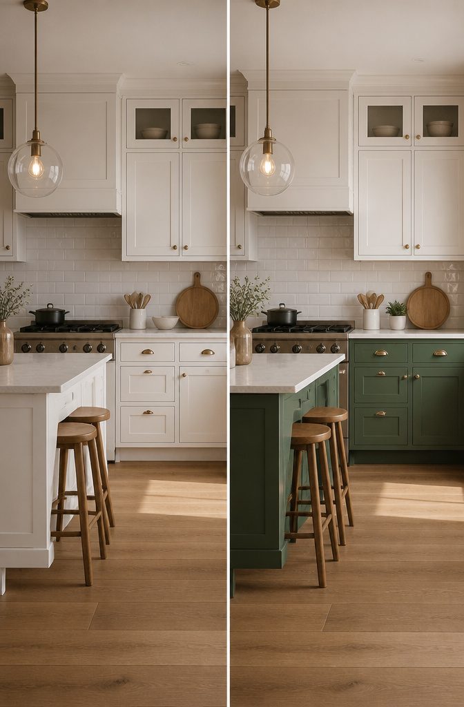
Painting the lower cabinets a different color than the uppers sounds like an easy win for depth, but the eye splits the room in half and reads two kitchens instead of one.
Designer Brian Paquette pulled it off in a southern California home by running the lower-cabinet green straight to the barstools, so the color wrapped the living space and the uppers became background. Without that bridge, the two zones fight.
The safer move for a weekend project is keeping the uppers quiet, in a white or barely-there tone, and letting the lowers carry the weight. Even then, the countertop has to earn its keep as the middle ground.
A stone or wood surface that picks up both cabinet tones keeps the halves talking to each other. Skip the busy backsplash or you have three horizontal bands wrestling for attention.
The mistake that kills this look is treating the two colors as equals. One has to lead.
If the lowers are the statement, the uppers should read as wall, not as a second statement holding up the ceiling.
16. Hardware Direction Changes
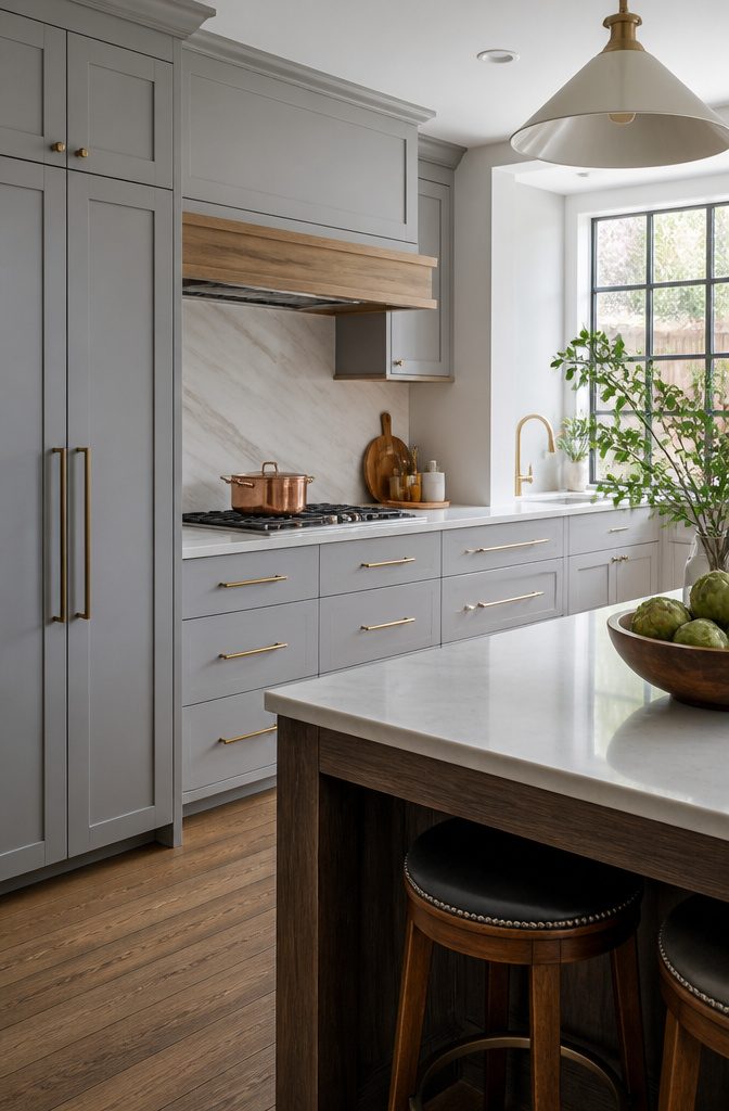
The cheapest way to read new is to swap which way the pull faces.
Vertical bar handles on tall pantry doors draw the eye up and make a low ceiling feel less squat; horizontal pulls across a row of drawers read calmer and wider on a small wall.
Mixing metals works the same way: black steel for the cabinets, maybe a brass faucet, copper pots left out on the rail.
The combination reads deliberate if you repeat each metal at least twice so nothing looks like the odd piece out.
The hole you just drilled will still be there when you change your mind. Cabinet doors with old hardware holes showing read as a mistake, not a refresh.
Fillers exist, but on stained wood or anything with grain they never fully disappear. Before you buy, hold the new base plate over the old holes to check coverage, or commit to a backplate wide enough to hide the history.
17. Mix Materials and Finishes
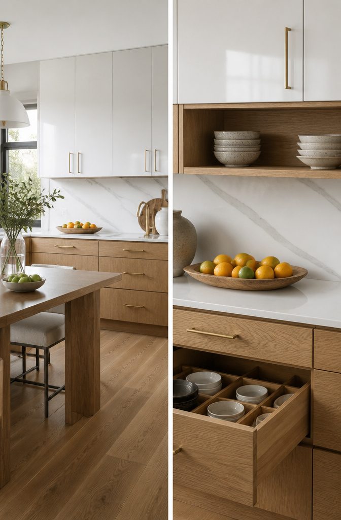
A kitchen where every cabinet matches exactly can feel like a showroom, not a home.
The adhesive that pulls mixed materials together is repetition: one finish has to show up at least twice, in different spots, so the eye reads it as a pattern rather than a leftover.
In my own rental, I kept the uppers in the landlord’s basic white lacquer and replaced just the lower doors with rift-sawn oak from a local cabinet shop.
The oak repeats in the open shelving bracket and the toe-kick, three hits that make it feel designed instead of pieced together.
Matte lowers against gloss uppers works the same way; the contrast has to be sharp enough to look deliberate, not like one cabinet missed its topcoat.
Texture against smooth needs the most care. A rough-sawn island panel next to painted perimeter cabinets only holds up if the color ties them, or if the hardware bridges both.
I tried matte black pulls on the smooth cabinets and left the textured ones bare-fingered; the hardware gap made the mix look accidental, so I added one long black rail on the island and the story held.
The risk with two finishes is three. A wood accent, a painted base, and a third metal or lacquer feature starts to read as collection, not composition.
Stop at two, repeat each at least twice, and the kitchen looks edited rather than accumulated.
18. Native Materials
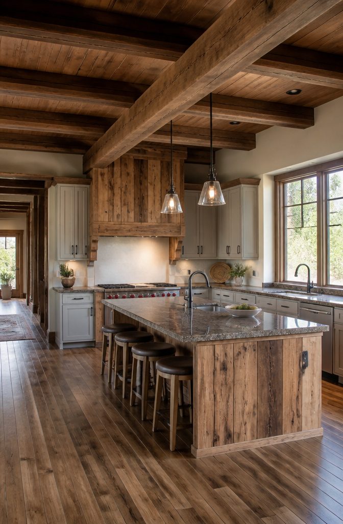
Pecky cypress from Florida wetlands carries a story that maple from a warehouse in New Jersey simply cannot. The grain, the color shifts, the small imperfections from regional climate all root a kitchen to the actual ground outside the window.
I spent months thinking native meant local-ish before I understood the gap.
The trouble is telling the difference between a mill that sources within your county and a distributor who slapped "local" on a container from three states away. Ask for the mill name, not the region.
A real supplier can walk you to the pile and tell you which watershed the tree stood in. If they hedge or hand you a brochure about Appalachian heritage, you are buying marketing.
Regional hardwoods do limit your palette. Where I live, the native options run darker and heavier than the white oak trending on every board right now.
That weight can close a small kitchen in if you use it on every surface. A single island in local black walnut, with paint on the perimeter cabinets, keeps the connection without the cave effect.
Budget bites harder here. Small mills move less volume, charge more per board foot, and often lack the finishing shop that sprays catalyzed conversion varnish in controlled booths.
You may need to buy rough and finish on site, which adds days and dust. For a weekend project, that trade matters more than the origin story.
19. Architectural Mimicry
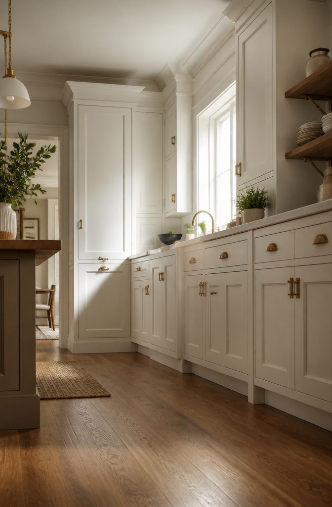
The best kitchen cupboard ideas often start with what is already in the room. Baseboard trim, door casings, and window stools leave clues about the era and intent of the house.
Matching the cabinet door profile to that existing trim creates a quiet cohesion that reads as original rather than renovated.
In my own reading through project accounts, the mistake that keeps showing up is copying too many architectural details at once.
A homeowner notices the crown molding, the picture rail, and the tall baseboards, then tries to echo all three on every cabinet surface. The result feels busy and theatrical, like a set piece rather than a kitchen.
One detail carried well beats three competing for attention.
Panel proportions matter more than most people expect. A four-inch rail on existing wainscoting suggests a four-inch stile on the cabinet door, not a two-inch one that looks shrunken beside it.
The same goes for the depth of the profile; a shallow bead on trim wants a shallow bead on the drawer front, not a deep ogee that belongs to a different decade.
The limit is budget and patience. Custom doors to match period details run higher than standard sizes, and lead times stretch past a single weekend.
For a renter or first-time owner, the payoff comes from choosing the one element that repeats most visibly, then letting the rest stay plain.
20. Trend Responsiveness
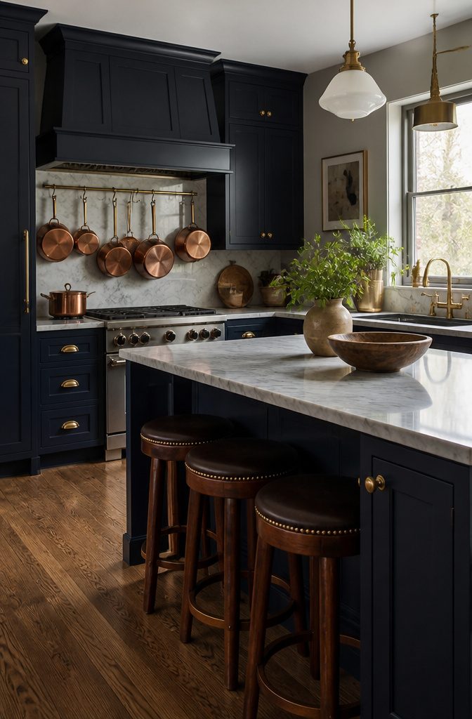
Cabinet color and hardware let you test a trend without the regret of a full kitchen gut.
A swap of pulls or a weekend paint job costs a fraction of replacing boxes and reworking layouts, and when the look tires, another round is doable.
The mixing-metals direction that showed up in 2025 hardware lines is a good example: black pulls against a brass faucet, copper cookware hanging nearby.
It reads as intentional layering rather than indecision, and if you sour on the combination, the pulls come off with a screwdriver.
What ages poorly is the bolder commitment you cannot walk back.
I once painted an entire bank of upper cabinets in a blue that read as fresh for about eighteen months, then sat there for six years feeling dated because the doors themselves were sound and I could not justify the do-over.
Paint the doors, not the boxes, if you want an exit ramp: live with the color, keep the original finish behind them, and reverse the decision without a full refacing job.
Frequently Asked Questions
What are some trendy kitchen cabinet colors?
Cheery yellow, soft neutral greiges, and earthy brown-grays like Farrow & Ball’s Mouse’s Back are all standout choices for 2026.
Deeper saturated tones such as navy with teal undertones or forest green that pulls olive in afternoon light also read as luxurious rather than dark.
The colors that age best are the ones that were never the single trend of the moment to begin with.
How can I maximize storage in my kitchen cabinets?
Mix drawers near the stove with doors near the sink so each tool sits where the hand needs it most.
Add oversized cabinets with at least 15 inches of vertical clearance for bulky items like Dutch ovens and slow cookers, and remember to add three inches to your tallest item before cutting shelf height.
Tall narrow storage belongs at the ends of runs, where it does not steal working depth from the counter above.
What hardware should I use for kitchen cabinets?
Switching hardware direction is the cheapest refresh available: vertical pulls on tall doors draw the eye upward, while horizontal pulls across drawers read calmer and wider.
Mixing metals works if you repeat each one at least twice so nothing looks like the odd piece out.
Before you buy, hold the new base plate over old holes to check coverage, since drilled holes remain visible on stained wood or grained finishes.